By Chris Rusak
Hard, it is, to stare beyond brandished, half-naked pinups and ponder the effects of an over-saturated visual culture slathered across streets of urban decay. Pop, or the direct use of popular media in the arts, has become go-to, steadily-dependable subject matter for artists to get a rise out of their viewers, as go-to as beautiful women deployed to sell wares by the advertising industry. Easily relatable, easily identifiable, and easy to gather materials with which to incorporate into a work, Pop is a natural choice, for some, to use to critique commerce and society. Minneapolis-based artist Greg Gossel attempts to do such in his current exhibition of twelve works, Head Over Heels, at White Walls, San Francisco, on view until June 29.

Hiding, Greg Gossel, 2008
Courtesy the artist
Gossel is talented, his graphic design skills clearly evident in the details of his practice. Color is a very important factor in his decisions, with palettes influenced by comic books, print ads, spray-painted concrete, and high-contrast sneaker lacing. Comic book imagery was a key element in his work several years ago, female victims and sassy vixens intermingling amongst corporate logos and cartoon interludes. In fact, surveying Gossel’s catalog since 2007, female centerpieces dominate most of his canvases, the chance depiction of John F. Kennedy here or a masked avenger there. Until about 2011, his continuing narrative was one of good and evil, heroes and heroines, with some bow-chick-a-wow-wow and a laugh tossed in to chalk it up as a good time. Summarily, for those four years, his compositions expressed an adolescent urge to work things out, efforts with a potential to become something greater, maybe even a bit political. Back then, Gossel would collect reams of printed material from the streets, distressed advertising detritus and molted billboard matter, and reappropriate them into his work, often forcibly repossessed into the artist’s domain. Taking this plethora of printed matter, he would collage directly on canvas and create lusciously textured surfaces, ultimately glazed with a varnish just begging for a surreptitious caress. A sense of time-steeled craftsmanship and serendipitous, sweat-smeared mishaps were palpably present in each object; the physical act of ripping resonated as an organically repetitive form, roughed frays offsetting the smoother pieces of paper abutted to them, increasing the sensual variety in each composition. And like one hopes to achieve through good collage work, by assembling disparate elements into a cohesive image, his sums were often greater than their parts.

Gucci Black, Greg Gossel, 2011
Courtesy the artist
In 2011, Gossel’s subject matter tightened two ways: first, corporate branding, e.g. Louis Vuitton LVs or Gucci Double-Gs, formed the main structure upon which many works were composed; second, compositions became near-direct derivatives of seminal works by Andy Warhol — centered headshots on collaged backgrounds. Liz Taylor and Jean-Michel Basquiat joined ranks with other dead icons, like Heath Ledger, in works which can only be described as commercial endeavors, artwork looking for a place above the couch, Kate Mosses on a wall instead of Kate Mosses in coffee table magazines. This diluting of subject matter, boring content underneath stimulating façades, mimicked the very process of using advertising and celebrity endorsement to sell objects with trivial purpose. The xeroxing of commerce to create art, while often fruitful for the pockets, stimulates worthwhile conversation as persistently as the cheapest fragrance-counter cologne department stores pawn on their customers. To his credit, Gossel shook things up the next year and changed course, displaying a heavy influence of Mark Bradford’s text-based efforts, introducing a noticeable, rectangular grid structure, and revisiting ripped, color-form compositions which are the most interesting of the lot. Though much of the work remained derivative, the hard left into a more restricted examination of semantics smelled like a better aisle to travel.

Nothing Left To Lose, Greg Gossel, 2013
Photo in piece by Neave Bozorgi
Courtesy White Walls and the artist
Presently, we see that he has revised his processes, turning, yet again, somewhere else. In “Head Over Heels”, women return as centerpieces to the composition, their images the product of a new collaboration with two photographers. Their figures are interlaced with more visual detritus; however, Gossel now wholly hand prints each composition, instead of directly collaging with ephemera. It appears that images have been digitally manipulated, scanned, overlaid, and organized on a rigid grid, whose lines — perhaps of graphite — stand out. For instance, in Nothing Left To Lose (2013), a model in a black brassiere emerges from a hole in a barrage of advertising strata. Giving the impression of a heavily wheat-pasted wall, the composition acts an off-the-cuff Instagram captured during a tourist’s European vacation. If one were to question this work by means of examining color and form, it’s hard to accept the relevance of including the shadowed beauty; if one were to question this work by means of examining content, it’s hard to believe this is somehow commentary or critique of urban environs.

Cheap Sunglasses, Greg Gossel, 2013
Photo in piece by Neave Bozorgi
Courtesy White Walls and the artist
Worse, perusing works such as L.A. Woman (2013) or Cheap Sunglasses (2013), it quickly surfaces that all twelve canvases are stringently formulaic: the same “The INTERNATIONAL BALLET” piece resides at the top of the picture plane; the same hard-edged, top-left corner of “ELYSEE-MON” soon stands out like a spectacle; black strips of PAS line the edges and corners. Gossel has sacrificed variety to facilitate mechanical repetition, a real danger of digital composition and an unforeseen invitation for the perception of laziness. Spending twenty minutes amongst the pieces of the show and any viewer can figure out the plan. We know that fashion and advertising are vacantly decipherable, do we want to endorse artistry to take the same route? Though minor variations in color and shifts in “ripping” occur here or there, these are essentially carbon copies of carbon copies, and the narrative of the original words are now running thin.
In an economy of shocking disparity, even, particularly, the cocaine-like art market of record-setting, multi-million auctions, megadealers’ parasitic encroachments, and art fair hoopla, the visual discourse incited by artists, especially when such incitement is aimed at the visual discourse, needs sharpened wit instead of adulation for luxury logos and hegemonically perfect female figures — do we really need more thin, white waifs gathered about? While Gossel once created canvases which begged to be touched, now we just see synthetic harlots realistically far out of our reach.

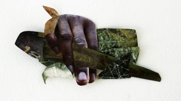
Boy Solider, Greg Gossel, 2007
Courtesy the artist
The press release for Head Over Heels claims that “Gossel has created more dynamic and vibrant work than ever before,” and nothing could be further from the truth. These works are static, demonstrated by the stark, stiff, repetitive forms monotonously tacked throughout. And these works are certainly less vibrant than once produced, for the simple reason that black and grey are the most dominant forces at play, sucking the life out their surrounding chroma. It’s time to break up with Kate Moss, too, her iconography about as relevant as a bottle of Obsession to anyone born after 1996. Perhaps it’s time for Gossel to screenshot that video floating around of Moss doing blow at a small party, collage that, and conflate the idea of optimal, mostly unachievable, perfected beauty with glorified chemical self-destruction. After all, if it’s commerce, advertising, and pitch perfect skin that contributes to urban decay and fuels the “constant onslaught of visual stimuli,” maybe one should quell that fire by leaving its imagery behind instead of continuously mirroring it on white walls. Or, at the very least, by making the critique more original and clear.
Chris Rusak is an artist and writer currently preparing to leave San Francisco.