When NSA documents released by Edward Snowden first went public, one extremely pointed and particular angle of outrage came not from privacy activists but from designers. Horrified more by the seemingly arbitrary typography choices and clashing colors than dragnet surveillance, some designers took it upon themselves to redesign the slides.1 These criticisms were mostly cheap shots—the PRISM slide deck was never a document designed for public consumption, let alone design critique. I sometimes imagine the people responsible for those slide decks, painstakingly arranging text on top of shapes in Powerpoint and grabbing tech company logos from Google image searches. These weren’t slide decks made by or for designers—they were made by people who, while within incredibly powerful government agencies, still worked in an office environment and probably thought of themselves as office workers.
This idea is disappointing because we expect more of the surveillance state than office software aesthetics. We’ve been trained to expect something flashier, something that conveys the gravity of the situation at hand. We expect giant screens, blue filters, replicas of the Starship Enterprise bridge. We don’t expect actual normal people who are as bad at using Powerpoint as we are. We don’t expect the surveillance state to appreciate memes or to use badly Photoshopped stock images or really to do anything as artlessly as mere mortals.
But to totally dismiss the visual vernacular of the surveillance state as merely bad or arbitrary design is to miss its tropes and motifs, which merit unraveling. After all, it’s not just PRISM. The aesthetics employed in the Snowden-released Five Eyes slide decks appear in the graphics and network diagrams of other defense agencies, as well as the contractors that serve them. Much of this aesthetic is inherited from the pragmatic designs of computer networking diagrams, which makes the grim ethical and political implications grafted onto these graphics all the more unnerving. But it also at times invokes a kind of broken socialist realism; images that take place in a weird pastiche of the real world. It’s this convergence of the fully functional diagram and the fully rhetorical landscape that gives the military slide presentation its fascinating character.
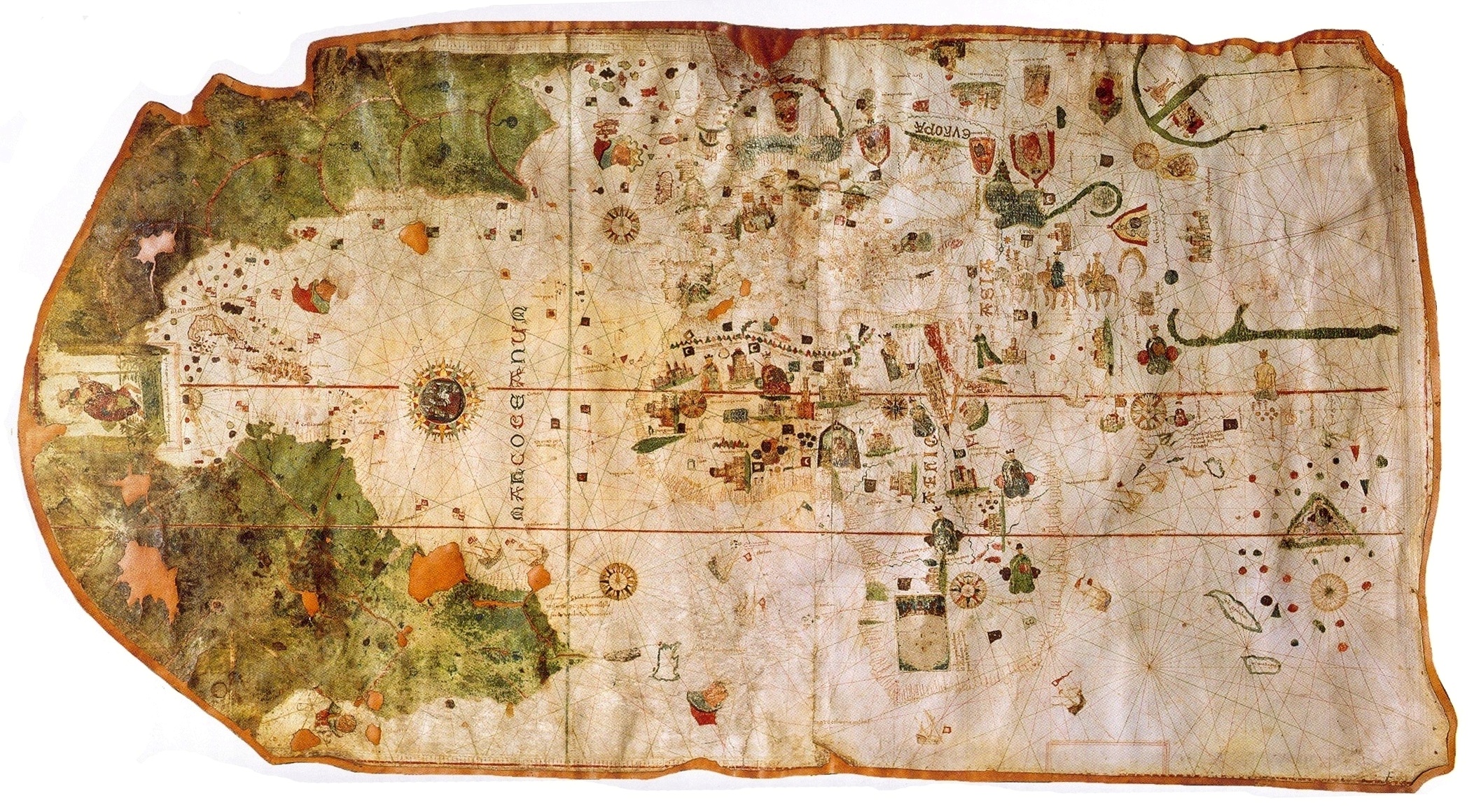
In a way, the diagrams and maps of military slide presentations and PDFs perform the same role that maps have always historically played for nation-states. In searching for a parallel, I found myself spending a lot of time looking at medieval maps. The pre-Renaissance mappa mundi are at times misunderstood as an indication that historians, monks, and philosophers of the time didn’t grasp the true shape of the world. But the way-finding map (at that time known as a portolan map, developed mainly for maritime navigation) and the explicitly political or philosophical map had not yet merged to become the political cartography we know today. And while these mapmakers probably didn’t have precise spatial data, literal way-finding wasn’t the point. What’s perceived as naiveté or a lack of skill in medieval mappa mundi is actually a matter of priorities. As described by cartography historian David Woodward, the medieval form of mappa mundi “not only represents static geography but is also an aggregation of historical information the mapmaker considered important with regard to his audience, with no attempt being made to separate or identify the two types of information.”2
Maps are and always have been more instantiations than reflections of the world, and for the most part what’s determined to be the canonical vision of the world-as-it-is comes down to which mapmaker holds the most power. In a time where we are constantly reminded that the existential threats facing the Western world are diffuse, networked, and operating more in an ideological than a geographic landscape, it makes sense that the state’s visuals of how to combat those threats similarly deem borders, topography, and at times even three-dimensional space irrelevant. The graphics and diagrams associated with military surveillance infrastructure are a kind of contemporary mappa mundi—more a projection of power against and onto the physical landscape than a representation of that landscape’s particular qualities.
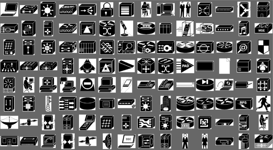
Within the trove of Snowden documents, few images refer back to physical geography. Many of the documents visualize various spying programs through network diagrams and flow charts. The iconography of the diagrams is, for the most part, typical of a technical flow chart—cylindrical pancake-stacked databases, desktop computers, arrows and diamonds. Searching for the history of these icons online doesn’t go very far. Databases are shaped like cylinders because that was what they looked like a long time ago, and nobody has bothered to change it; to question the network topology icon is akin to questioning the design of the alphabet. The flow chart as used in computing goes as far back as 1949, but apparently wasn’t formally codified until around the 1960s (as seen in this IBM document on creating flow charts from 19693). The NSA diagrams also at times reference or use the Cisco network typology icons,4 a collection of images ubiquitous in part because they’re free. There is something vaguely comforting about the fact that in a period where networked technology seems to mostly fuel an anxiety to move fast and break things, the language for mapping out the network remains static.
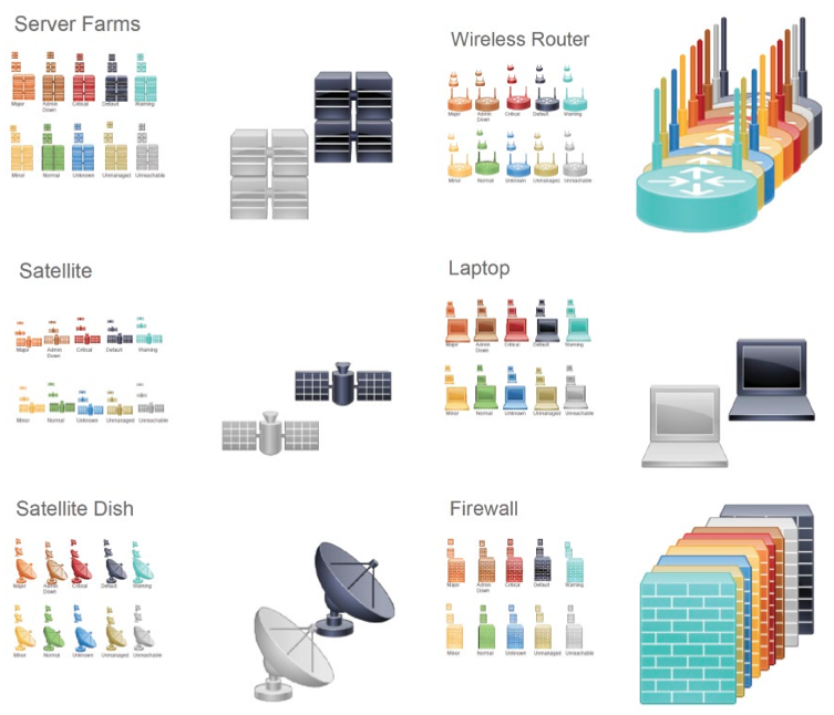
CISCO Systems icon library. Courtesy of the Internet.
These diagrams tend to exist in a floating negative space, with few corporeal dimensions. Icons depicting human beings tend to portray human actors as bad actors (one slide from a Special Collections Service presentation illustrates “hackers,” ”terrorists,” and “criminal groups” simply by tinting stock images of humans a sinister shade of red). The images are overwhelming but impersonal—while they demonstrate the ease with which defense agencies can collect personal data, the person tied to that data is a cipher subsumed within its framework. It is hard to imagine oneself as a data point in that framework.
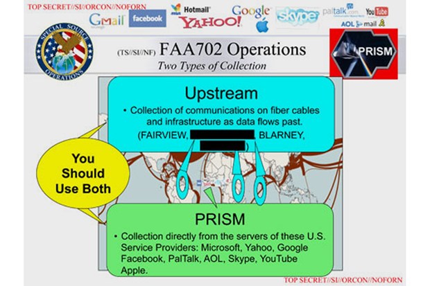
At times there are geographic maps in the Snowden documents, although they are more often decorative than informative (such as the borrowed submarine cable map in the PRISM slides that’s mostly obscured by reminders that given the choice between using data from the Upstream collection program gathering data from those submarine cables and PRISM’s collection program gathering data directly from the servers of sites like Facebook and Skype, you should use both!). More often, the landscapes and maps gesture toward the real world, but exist in weird composite landscapes. In documents (more often from the Army or Navy than the Snowden archive) explicating or promoting other total information awareness frameworks, a recurring mappa mundi form is a snow globe-like projection of a fully networked battlespace. Actors on the ground, in the sky, and beyond the atmosphere connect across this contained landscape. Scale is not really a factor in these landscapes: reaper drones, mine-resistant ambush protected vehicles (MRAPs), and satellites are all roughly of the same size, equivalent nodes in a single network operating simultaneously and tirelessly to create a perfect ecosystem of constantly flowing information. (The fact that these maps portray a flat world presumably needs no further analysis.)
CISCO Systems icon library. Courtesy of the Internet.
The irony of using these diagrams and illustrations to explain the reach and capacity of mass surveillance networks is that the entire reason these systems exist is to be able to better visualize and grasp vast quantities of information across vast geographic expanses. Despite allegedly having the capacity to conjure up millions of satellite images and surveillance drone feeds and locations of networked devices in simultaneous real-time, we see clumsy abstractions of that capacity.
There are probably valid technical and practical reasons for choosing diagrams over demonstrations, but it hints at an awkward truth about the fallibility of global surveillance systems. The real world in real-time is always imperfect and uncertain, and operating at the scale of spy agencies means taking in those imperfections and uncertainties at an overwhelming scale and transforming them into actionable facts—whether the facts are there or not (a feat perhaps most famously performed by Colin Powell in his 2003 testimony to the United Nations arguing for an invasion of Iraq, using satellite imagery to prove the existence of imaginary nuclear weapons). It is far easier to believe that the mission is critical, the ethics are sound, and the system works when looking at a schematic of it working than when faced with the fallibility and fragility of these systems, not to mention the actual humans subjected to their harms. The mappa mundi of surveillance state slide decks illustrate a cosmology as much as they illustrate technical systems. Within that cosmology, real countries become composite any-places, real people become threat icons, and hard ethical decisions become office work.
For the outside viewer, this cosmology remains incomplete—journalists working with the Snowden documents are by necessity selective in what they do and don’t publish. The slides that get published are, one assumes, the visuals they hope best distill a single point, but they also obscure the full context of these images and the weird theatrics of the slide deck, fragmenting their narratives by releasing excerpts asynchronously and out of order. Full slides found in obscure directories on .mil websites have, presumably, been fastidiously reviewed to ensure that nothing the public sees falls out of bounds, but are similarly devoid of context.
Faced with this absence of context and of intent, I think back to that NSA employee designing the PRISM slide deck and wonder (admittedly, more facetiously than not) whether bad design could be itself a kind of subterfuge, a passive-aggressive gesture of resistance intended only for internal critique. While it’s probably an unlikely narrative, it remains at least plausible. The clumsiness and poor design of these graphics makes us uneasy for the same reason that it might allow for a weird kind of hope: it shows that the people behind these systems are as imperfect, fallible, and human as systems themselves, which means perhaps they remain capable of dissent and will perhaps be inspired by their former colleague Snowden and take action.
1) The Best and Worst Redesigns of PRISM’s Atrocious PowerPoint
2) Woodward, David. “Medieval Mappamundi” in The History of Cartography Vol. 1, eds. J.B. Harley and David Woodward. Online at University of Chicago Press.
3) IBM Flowcharting Techniques
4) Network Topology Icons