Deborah Kass: No Kidding
Paul Kasmin Gallery
515 West 27th St., New York, NY 10001
December 9, 2015 – January 23, 2016
When someone says “no kidding,” it can generally be interpreted three ways: one, as a warning to remain stern and humorless; two, as a kind of expression of wonderment punctuated with sudden enlightenment; or three, as a blatantly sarcastic retort. When it comes to painting, the “canon” of art history commands many things of its artists. Brooklyn-based artist Deborah Kass delivers all three iterations of those words in her latest solo exhibition at Paul Kasmin Gallery in Chelsea. All at once, she is relentless, educational, and bitingly witty.
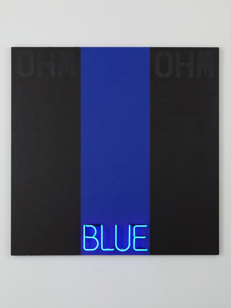
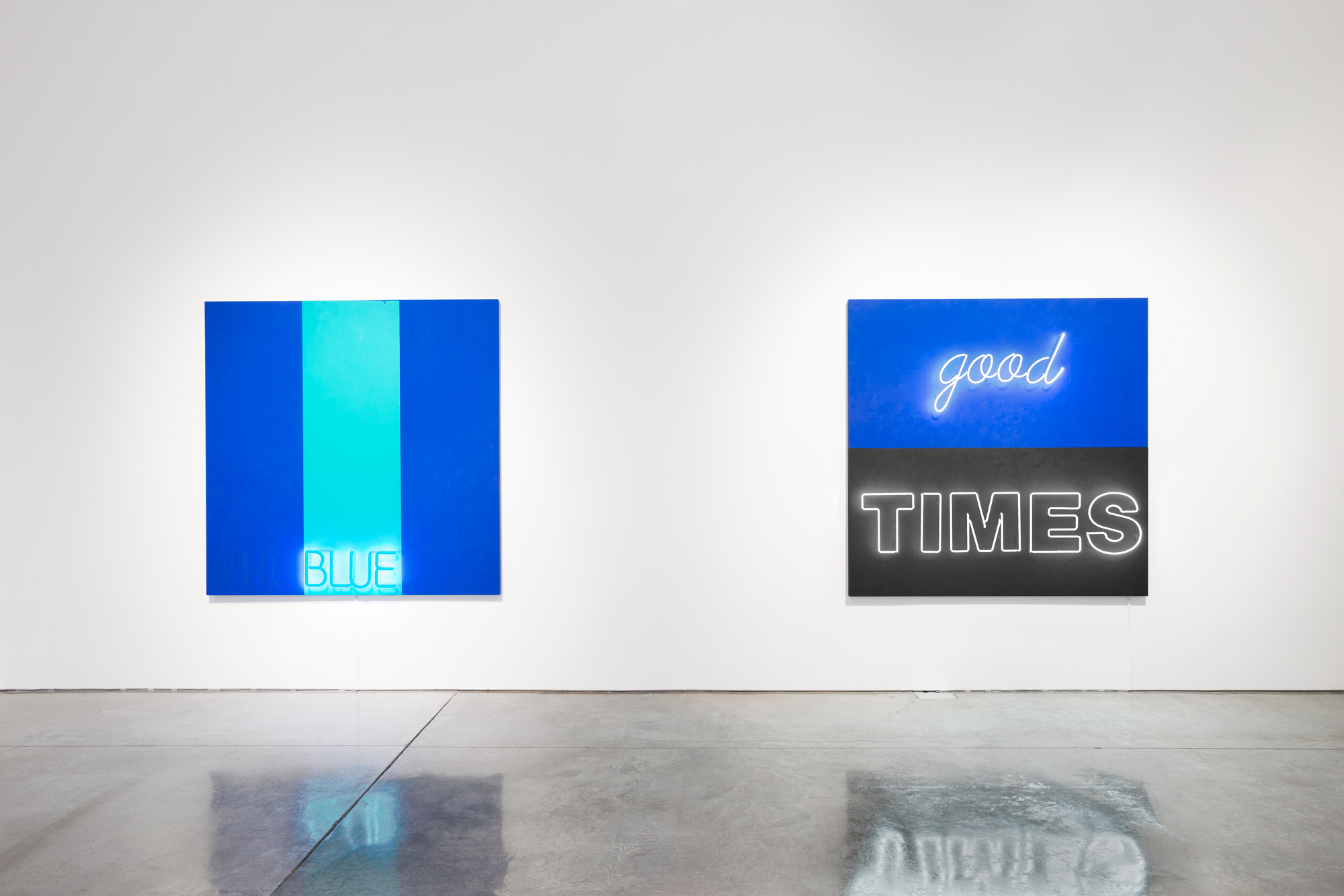
Deborah Kass, Blue #4, 2015. Mixed media, 72 x 72 inches, 182.9 x 182.9 cm. Image courtesy the artist and Paul Kasmin Gallery.
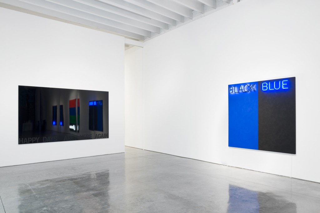
Neon light as an artistic medium is now an overused punch line: from early examples of Dan Flavin’s minimal light arenas to pithy phrases deployed by Tracey Emin, Martin Creed, Doug Aitken, Alfredo Jaar, and others, the dancing particles inside arrays of glass tubes have fizzled into ubiquity. While borrowing street signage to parse the excesses and grandeur of urban life in a non-narrative format is an important development in the history of art, its appearance nowadays barely conjures more than an amused smirk (not solely thanks its market saturation). I visited Kass’s studio earlier this year while the many of her neon-based works were still in production. Honestly, I had my doubts. Haven’t I seen something like this far too often? Almost 10 months after seeing works such as Black and Blue #1 and #2 (2015) in the planning stages, my doubts were silenced. Acting as a physical reference to the color upon which it sits, the neon lettering also becomes a psychic curveball; the words “Black” and “Blue” sit atop the “correct” colors on the first canvas, and are then reversed as “Black” hovers at the top of the blue color field and the “Blue” over black. It forces a reconsideration of the perception of light, depth, and, more importantly, our conditioned attitudes towards signs and signifiers in the larger world. It is also worth noting that “black and blue” directly references the color of bruised skin, a direct consequence of intimate physical violence. Again, depth perception counts: Who is the attacker? Who is the victim? Another interesting canvas that literally breaks the color lines of the “black and blue” works is called We’ll Be Young Forever (2015), where each word in the phrase is barely visible through dense rows of red, blue, green, and black, respectively (the latter is rendered in white neon script). My first takeaway was the sobering duality of “Forever” in context. It is brilliantly illuminated in the present, but both viewer and, eventually, the sign itself will short out into nothingness. The words “We’ll Be Young” are nearly lost in their color fields and sight is strained just to work out its outline. Isn’t that just the way: once you’ve actually come to realize the loud, blaring boldness of youth, it runs away (along with your sight).
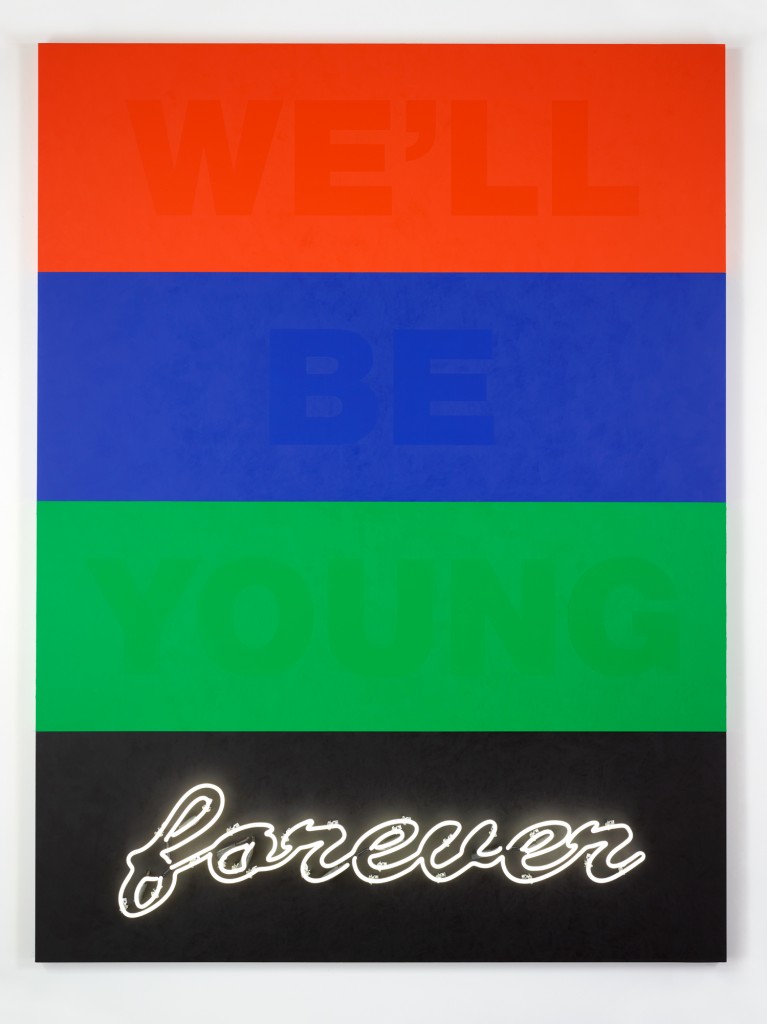
Deborah Kass, We’ll Be Young Forever, 2015. Acrylic and neon on canvas, 96 x 72 inches, 243.8 x 182.9 cm.
Being a fellow Jewish woman (I hope this would be a near-universal response from others like me), I grinned broadly at seeing Kass’s largest, most central work in the show, which refers to a lyric sung by Barbra Streisand printed at the bottom of a canvas bathed in black automotive paint with alternating strengths of reflectiveness. Happy Days Are Here Again (2015), most immediately for me, rang out with Streisand’s unforgettable duet with Judy Garland on her eponymous TV special in 1963, with Garland rounding “(C’Mon) Get Happy” with Streisand’s “Happy Days.” Kass has positioned Streisand as her own kind of Liz Taylor to her Warhol, as the star appears in several prominent past series (one of which replaces Warhol’s Double Elvis with Streisand’s portrayal of cross-dressing Yeshiva student “Yentl,” from the 1983 film of the same name that she starred in, produced, and directed). With this latest work, Kass extracts the optimism of the lyric—originally pulled from the 1932 campaign song for Franklin D. Roosevelt—and tosses it into the realm of “finish fetish,” endless cosmetic makeovers, and the varying shades of darkness that are also unforgiving mirrors.
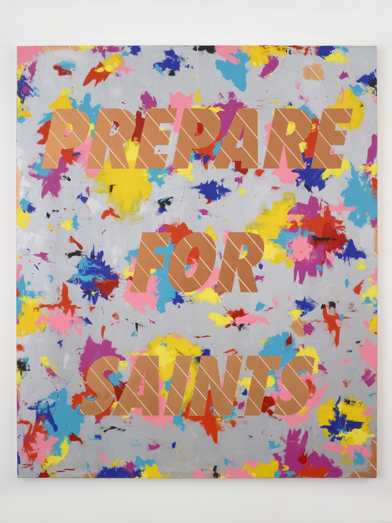
Deborah Kass, Prepare for Saints #2, 2015. Acrylic on canvas, 72 1/4 x 60 3/8 inches, 183.5 x 153.4 cm. Image courtesy the artist and Paul Kasmin Gallery.
The canvases at the back of the gallery space, bearing the words “Prepare For Saints” and “The Band Played On” are less austere, more vibrant in their physical quality, but lacking the sucker-punch power of the “featured” works towards the front. Yet, every single work (with the exception of Happy Days) in the exhibition shows the movement of paint across the surface, reminding viewers that no matter how much she remains in the current moment of the handmade gesture fading into the background, Kass is unequivocally a painter. With painterly marks in one hand and new formations of nagging social ills in the other, Happy Days are, indeed, Here Again.
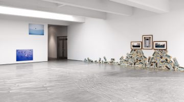
Deborah Kass. Installation view, No Kidding, December 9, 2015 to January 23, 2016. Image courtesy the artist and Paul Kasmin Gallery.