José León Cerrillo and Ilja Karilampi
+ Bookstore curated by Paul Chan
Kiria Koula, San Francisco
3148 22nd Street, San francisco, CA 94110
(A performance by Ilja Karilampi will take place on December 12 at 7 p.m.)
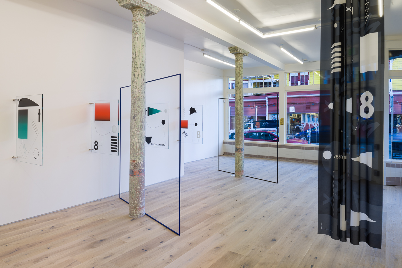
Although language is a part of the public domain, it is the configuration and the context that give it meaning and value. When the meaning is lost then the value is difficult to perceive—at least readily. José León Cerrillo’s POEM is comprised of five glass panels mounted perpendicular to one wall, with enough space in between to view both sides. The glass panels are silkscreened with recognizable symbols such as crosses or arrows, Roman letters, Western Arabic numerals, and simple geometric shapes such as circles, rhomboids, and triangles that are arranged in careful compositions. In searching for relationships, the disparate messengers applied to the transparent substrate provide no clear translation. Because they are glass, the neighboring pieces become one with each other when looking through one piece to the next. Although the complete series is titled POEM, each piece is subtitled, such as “theft and gift,” or “positions taken in public debate,” or “free again.” These subtitles allude to various functions of language in socio-political contexts, particularly in cases where one might have to defend themselves, or when speech is used to evade commitments, incite harassment, or form other forms of binding agreements. Cerrillo makes a point to reiterate the precarious nature of perception through these nonsensical works.
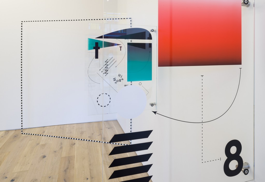
In viewing Cerrillo’s POEM I see a correlation with John Cage’s plexigram series of 1969. The pieces were made in response to his friend Marcel Duchamp’s death in 1968. Cage felt he had nothing to say about him, thus the title of the works: Not Wanting to Say Anything about Marcel. The series included eight pieces, each consisting of six clear and two amber-colored Plexiglas panels mounted one in front of the other. Each panel is screened with various red and black letters in a variety of vertical and horizontal configurations, backwards and forwards. When viewed from the front the symbols hover away from and near each other, creating depth. Yet the whole does not read anything in particular, thereby eliminating meaning and rendering it as nonsense. Cage’s panels are intended to be assembled in any configuration, opening them up to chance so that they will be unique each time. Cerrillo’s work has this same potential both conceptually and spatially. By considering the lack of meaning rendered in the pieces coupled with the chosen materials, Cerrillo calls attention to the ephemerality of the spoken word, the precariousness of the written word, meaning lost despite transparency, and the delicacy of all that is language.
Also by Cerrillo are three large, iron, square frames titled Subtraction screens, which are set on the floor, leaning on the columns and intersecting the walking areas of the space and crisscrossing the POEM piece. As stationary objects, the frames act as parameters for one’s view by creating compositions within them based on where the viewer stands. But POEM achieves Cerrillo’s intention of spatial shifts on its own and perhaps does not need the Subtraction screens around it. The frames are a signature element that Cerrillo often uses in his work as a means to augment and shift the viewers’ perception of the space, but in this case, the geometry of the glass functions similarly to the way that he uses the frames. The frames create an awkward clutter for the gallery-goer to navigate through in person (especially at the crowded opening when people were bumping or walking through them). That aside, when viewing the installation documentation of the work, the frames create their own additional relationships within the photograph’s frame. In a sense, their necessity here seems to be vital as architecture and serves the purpose of the archive really well. There is also a translucent gray-scale curtain hung from the ceiling to the left of the room printed with similar patterns as POEM. As someone who works with textiles, this piece seems incidental as a singular object, and the material is neither lux nor utilitarian enough to be a companion piece with the rest of the room. In general, Cerrillo’s work consistently uses elements of language, space, geometric shapes, and typography, both conceptually and as concretely. Since this show is his first in San Francisco, it is a good opportunity to see his work in person—especially POEM.
For his portion of the two-person show, Ilja Karilampi included four videos and a series of etched brass signage that each draw from biographical narratives rooted in both reality and fiction—juxtaposing pop culture with subculture (especially music), slang with academic/orthodox vocabulary. As someone whose personal lexicon does not include most of the references that Karilampi makes, I am left with a desire to research heavily on the Internet for a granule of semblance amongst the disparate stories and iconography.
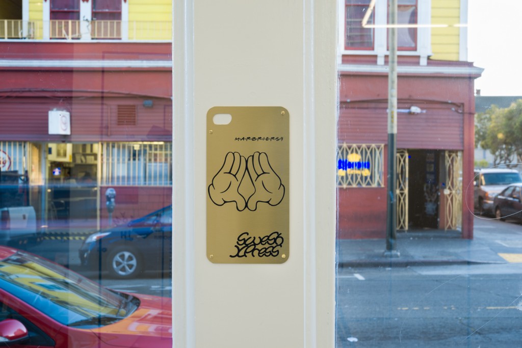
One of the brass signs in the show includes gloved hands like those of Mickey Mouse, and the name of the Swiss gallery Marbriers 4, written in the same font as the television show Friends. In the lower right-hand corner is “SweSH XPress,”written like graffiti, which was the title of his exhibition at Marbriers 4 earlier this year, and which shares the title of Karilampi’s fictitious high-speed rail that travels from Sweden to Switzerland. Nearby on a monitor is the video SweSH Xpress Geneve Trailer that coincided with his Marbriers 4 exhibition. As does most of Karilampi’s work, the space between reality and fiction grows ever closer together as the viewer listens to the very convincing male narrator explain the rationale for creating the high speed railway. Admittedly, the films are worth a second look since there are four total, showing on only two monitors with headsets. The other films navigate biographical terrain that borders on the absurd and unbelievable, featuring rapper Dr. Dre, musician Jimi Hendrix, and queer performance rapper Mykki Blanco.
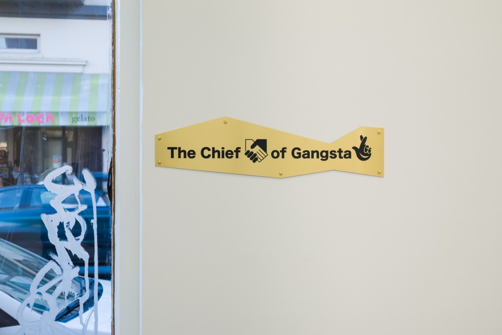
Across the room, another sign distracted me with hours of online perusing. Through the most obscure Internet sleuthing, I was able to determine that The Chief Dean of Gangsta Shape is a shout out to London musician and artist Dean Blunt, whose show is currently mounted at [ space ] in London. Karilampi’s sign includes the logos that Blunt uses in the exhibition poster. They were haunting me with their familiarity so I had to investigate.
First, I googled “smiling hand lucky logo.” I found the logo within a couple of seconds of browsing around and learned it is the recently contested logo for The National Lottery in the U.K. I then proceeded to look for the other logo by googling “black and white handshake heart corporate logo.” After hovering over a lot of choices I chose a Pinterest that lead to a link with the name “dean” in it. I then googled “black and white handshake dean corporate logo,” which led to a plethora of articles on how the punk rock band Black Flag’s 4-bar logo became a punk symbol in general, and vintage black and white images of presidents, Hollywood celebrities, and popes shaking hands with people. But somewhere in that mix, Google remembered my search for the smiling hand logo, and there it was among a bunch of unrelated stuff, standing out like a sore thumb. I clicked on it and was lead to Dean Blunt.

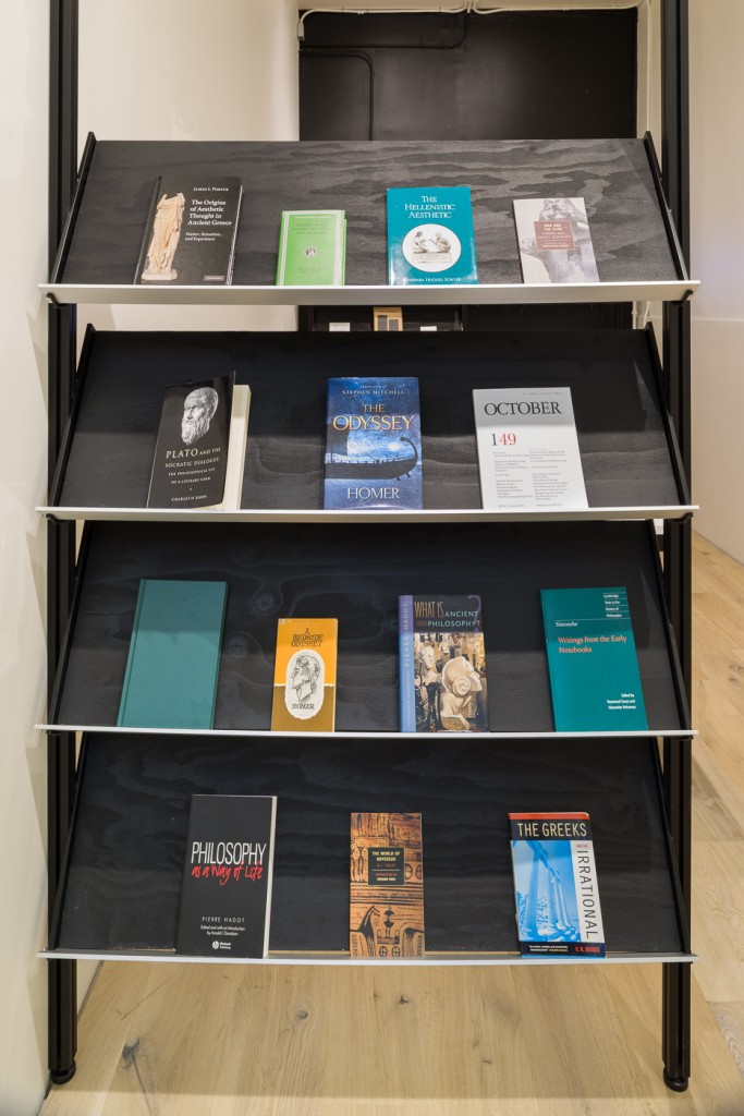
I am not sure if all of this investigation satisfied me, but it serves to point out a possible greater purpose that art serves as a catalyst for inquiry, rather than spelling everything out plainly as a didactic object. The whole journey seems apropos to Karilampi’s appropriated practice and plethora of gathered source materials for his work. However, my story of bumbling investigation echoes Karilampi’s non-fiction prose that he often writes to accompany exhibitions, leading readers through a story of his thought process. It is a seemingly intentional strategy, though not provided for this exhibition, and so even I, as an inquisitive viewer risk misreading the work. Similarly, Paul Chan’s latest essays, featured in the bookstore portion of the gallery, showcase his practice of “reckless reading,” this time with the intentional misreading of Homer’s Odyssey. The bookstore carries a selection of Chan’s books for purchase as well as an assortment that he curated for the space so that people can browse or purchase. The selection covers a tight span of topics focusing on language, including ancient Greek ethics of Socratic semantics and Nietzschean philology. Some titles in the bookstore are The Greeks and the Irrational by E.R. Dodds, Homeric Hymns by M.L. West, and Philosophy as a Way of Life: Spiritual Exercises from Socrates to Foucault by Pierre Hadot.
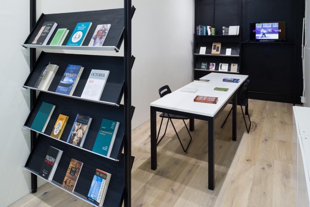
In all, this is an industrious inaugural exhibition for Kiria Koula, founded by owners Leticia Vilalta and Rodrigo Peñafiel. Curated by Juana Berrío, the future exhibitions will be conceptually rigorous and include platforms for discussion. The bookstore will serve as a research lab for artists, where they will be invited to curate a selection of books, hold readings or lectures, and develop written contributions.